Farmstead website rapid iteration
Improving conversion from 14% to 77% in under two weeks was just the beginning of this exciting, creative project for a San Mateo startup.

Client: Farmstead
Project: Copywriting (web copy and Facebook ads); content strategy; art direction / photo selection; basic design and layout using Instapage
Timeline: 2 months
Date: Summer 2016
URL: Sadly, Farmstead shut down in 2022.
In August, when a friend and colleague referred me to the guys behind Farmstead, I was thrilled. As a former entrepreneur myself, startups are close to my heart; also, I firmly believe in the importance of eating local and seasonally.
A few months before, Farmstead had started from a post on Nextdoor.com; it had grown quickly into an organic grocery delivery company unlike any other. It’s not a delivery service that brings you groceries from other stores, like Instacart; nor is it a brick and mortar that delivers.
My first task was to improve the conversion rate of the home page, which was currently seeing only about 14% of users clicking through to the product page. Here’s the headline they were using at that time:

I wrote two different versions of a new home page and the client chose one to test. (Throughout this process, I had the opportunity to listen to dozens of recorded user testing sessions via usertesting.com.) Here’s the new headline:

The page performed well in user testing, and after a few tweaks, we uploaded it for live testing via targeted Facebook ads. The new page converted at 77%.
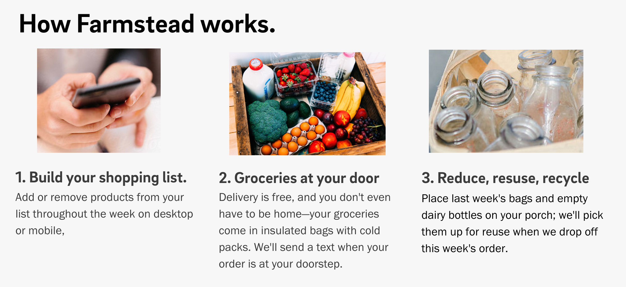
There was no time for patting myself on the back, though. The actual “shop” page wasn’t converting as well as the client wanted, so I set about rewriting the content of the home page to set users’ expectations and form an understanding of how the service works so they wouldn’t have any unanswered questions by the time they clicked through. The first step was fine-tuning this section:

(Yes, there’s a typo in there. I grabbed this screen from a prototype.)
Users loved this clear description of how the service worked, and this section successfully walked the line of not saying “it’s a subscription service” (it isn’t) but implying that users would continue to order each week as the client hopes.
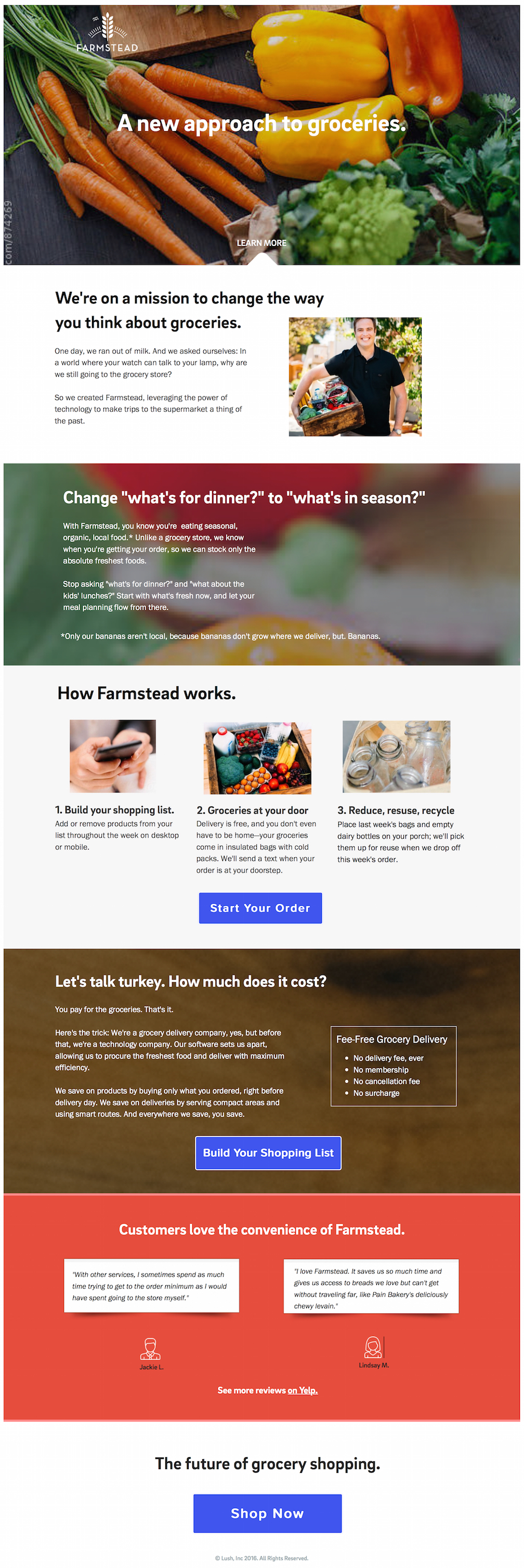
From there, we worked to make the page answer other questions and clearly express Farmstead’s identity (technology company first), business mechanics (users were thinking the “no fee” structure was too good to be true, so we explained why it works), and ethics (farm to table, all organic). I went through many iterations, but the final version of the page (not live at this writing) addressed all of these concerns:

Once we had the page dialed in, I wrote a slew of Facebook ads, selecting photos to accompany each and ensuring that character count worked for various formats including mobile. I often altered the target URL to make the most of the limited character count.
Can’t wait to see what’s next for this fun and exciting project!